Project Overview
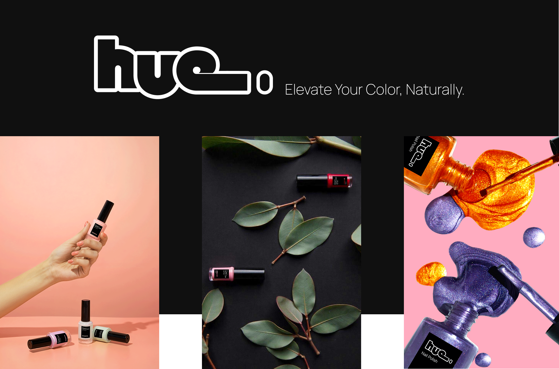
Hue Nail Co. is a modern, eco-conscious nail polish brand that celebrates color in its purest form. Our branding focuses on bold aesthetics, sustainability, and a strong visual identity that resonates with both beauty enthusiasts and environmentally conscious consumers.
Brand Identity
Logo Design
The Hue Nail Co. logo is a contemporary, typographic design that reflects the brand's modern and artistic approach to nail color. The rounded, bold typography with a sleek outline creates a clean and recognizable brand mark.
Color Palette
Hue Nail Co.'s branding is rooted in vibrant, high-impact colors that evoke creativity and self-expression. The selected hues align with natural elements, from warm earthy tones to bold, statement-making shades.
Typography
The brand employs a minimalist yet expressive typeface that complements the bold logo design. The typography is clean, sans-serif, and easy to read, ensuring a sophisticated and modern look across all marketing materials.
Visual Elements
Product Photography
-
Bold and Vibrant Imagery: Nail polish spills, high-gloss finishes, and dynamic color contrasts emphasize the richness of each shade.
-
Natural Integration: Soft, organic elements such as leaves and natural textures highlight the brand's commitment to eco-conscious beauty.
Packaging Design
-
Minimalist Black Labels: A sleek, black design with white typography creates a sophisticated and high-end feel.
-
Color-coded Bottles: Each bottle features a unique HEX code on the label, making it easy to identify shades while reinforcing the brand’s dedication to color precision.

